Analyzing the Journey
I arrived at Habitat at the beginning of an ambitious period of growth for the affiliate. When getting up to speed on fundraising I found that there was no record of how the organization interacted with donors over an extended period of time. I felt a journey map would help quantify this process and show the value of several UX concepts:
Measuring: Incorporating measurement into a teams process involves many facets. Goals need to simplified and specific, technology needs to be in place to actually record the results, and reflection and analysis is required to make the results usable. The journey map acts as a strong visual to guide folks through this process and reinforce its importance.
Consistency: Several departments may be involved with a donors journey each with different messaging and approaches. A map acts to codify the interactions our staff has with donors and creates a visual of how confusing overlapping messaging can be.
Iteration: I wanted our teams to start thinking about how to cultivate existing donors instead of relying on sheer numbers of new donors to improve our engagement year to year. After establishing a consistent baseline we would be able to measure the effectiveness campaigns, set realistic goals, and iterate upon out existing work.
The Question
Starting a process like this can be overwhelming, especially when you are guiding a team unfamiliar with the process. To simplify things, we decided to begin the process with our biggest fundraising event, a free breakfast, which drew in 1500 people which gave us a big pool of people and data to work with.
To focus the team we settled on one main question we wanted answered: What strategies can we use to retain new donors acquired at this event for 3+ years.
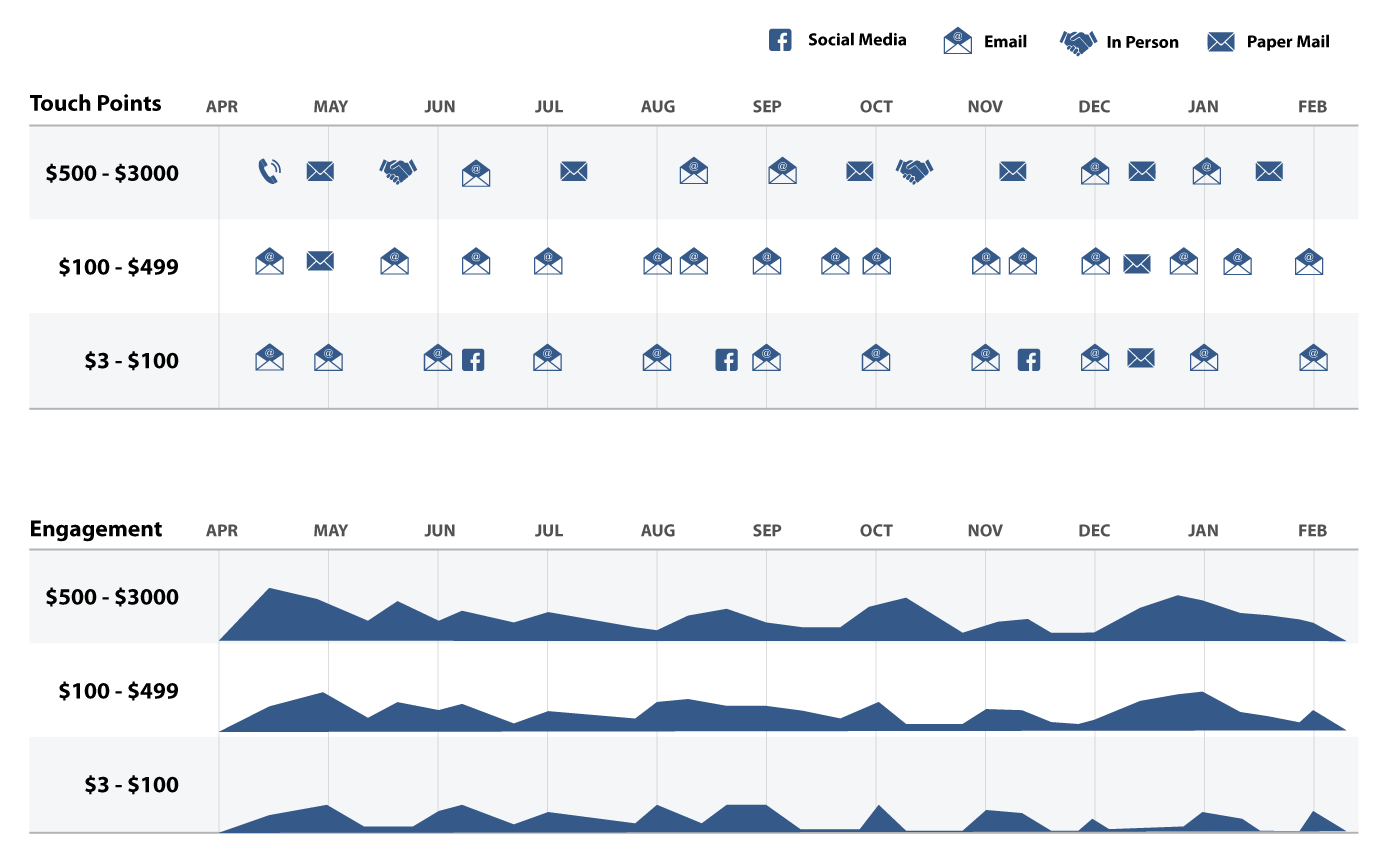
An early sketch of a year of interactions starting from the breakfast with our three different giving levels. These were collected from our email and social media systems, event managers, and portfolio managers. Engagement was an aggregate of stats taken from email opens and clicks, social media analytics, and anecdotes.
The Nitty Gritty Data Dance
Without context, a large complicated event may seem like too much to bite off versus something like a small campaign. Our numbers, however, are small due to being very local. We did not have the luxury of running targeted campaigns to thousands of people. To deeply analyze our donors behaviors we needed to start with a large, rich, historical data set. The breakfast event is consistently well documented going back over 5 years. This allowed us to look at 3 year segments of data to see how our retention strategies were currently working and form a baseline from which we could iterate.
Above is an early sketch used to gather and organize engagement data. This artifact helps illustrate to stakeholders how different our communication is for donors of different levels and how they relate to that donors engagement over a year.
Personas
First we created a set of personas for different types of donors. We had some general categories to start with from the Habitat Brand Guidelines book. We also had a wealth of data in our donor management system that we used to find patterns in donations and create more specific segments. One key criteria or KPI measured donor retention. We defined this by requiring a user to have made two gifts to Habitat within 1 year. Survey data and anecdotal information from our resource team helped inform what our donors goals were and what they were feeling and thinking at different points in their relationship with Habitat.
By assembling a bigger picture of how we were interacting with our donors we were able to identify several areas where we could improve our donor experience:
Avoid communication dead zones for mid-tier donors who were not getting constant attention from portfolio managers and provide local for donors to get involved and experience Habitats impact first hand.
Speaking to local issues that donors care about with email content tailored to their segment.
Create an email and social media campaign that shows how the donors money is being used locally today.
Better timing of appeals to coincide with inspiring events (this was also folded into a collaborative marketing model that Habitat International began testing).
Look closely at messaging across marketing channels. Ensure a mix of content that engages existing and potential donors.
Timed nuturing emails to ensure consistent communication.

Improving the UI
The Habitat website was due for a design overhaul but unfortunately the time and resources to do this were not going to be available. This was partly due to the day to day demands of my position and a lack of budget to hire adequate support for a rebuild from scratch. The solution was to make updates where they had the most impact. The blog, events, and fundraising pages being top priority.
Condensing several portal pages into one directory allowing folks to get where they are going in as little as 2 clicks rather than 4 or more.
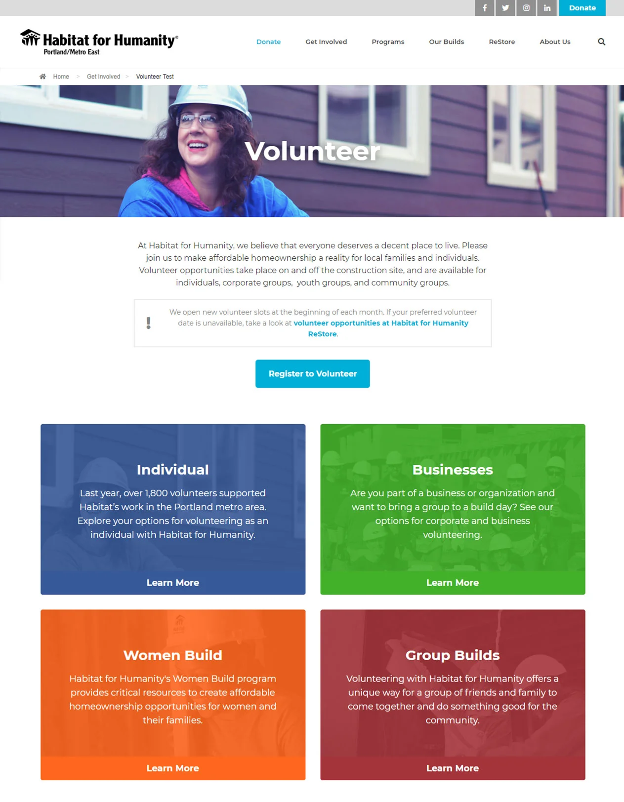
An urgent issue we wanted to address were “Portal Pages”. Click after click you would be confronted with 2 - 3 layers of similar looking pages with a grid of 4 images, and blurbs. It was hard to tell where you were and the information was difficult to parse. According to our analytics most people did not make it more than 2 levels deep before exiting, anything below that was almost unseen. Aside from burying content, the overall UI of these pages needed help. The updated design above for our donate page addressed the following issues:
Too Deep: Our analytics showed a clear problem of folks having to click through too many confusing pages before finding what they needed. After stakeholder interviews with different departments, we found that the pages that mattered most were simply not being found.
Unclear Design: The title of each quadrant was separated from the description by an image that, in many cases was unrelated to the actual content of the link. ie: Individual has a picture of a group of women, this is right above Women Build which has a picture of staff outside the office.
Hierarchy Issues: The first thing users see is a volunteer button, to the right is an information box that largely went unread that contained what the team deemed essential information about the scarcity of available volunteer slots.
Too many similar pages: Having so many levels of navigation with the same layout and no breadcrumbs made it difficult for users to know where on the site they were.
The updated design:
Gets users to their intended content in as few as 2 clicks rather than 3 to 5.
Modernized the style of each tile, reduced clutter, and flattened the navigation hierarchy by combining multiple layers of portal pages into one directory.
Added breadcrumbs to child pages to allow the user to easily see where they are and how to access previous content.
Navigation Update
The Habitat website used a mega menu consisting of 54 different pages with 3 levels of visible hierarchy. The actual site hierarchy, in some cases, went 5 to 6 pages deep (as addressed above). Creating directory pages only got us part way to our goal. They still had too many unclear options. We wanted to identify high value content, consolidate non-essential information, and flatten the hierarchy to ensure simple and direct paths existed between the home page and essential information.
Analytics & Competitive Analysis
To start off our project we looked at our own analytics to determine common user paths, bottle necks, and underserved pages. We also spoke with department stakeholders to discuss what they felt was important information that was not being presented to their users, be they donors, potential homebuyers, or volunteers.
We also looked at other successful affiliates around the country. There were several common elements we found in their top level navigation that helped give form to our intuition and anecdote based hypothesis.
Some common themes we noticed
There are always two donate buttons, one that goes directly to a donation form and one that gives the user more options to donate and these are both top level items with a stylistic differentiation or with the non-form option being called “Support”. Driving customers to either of these choices is generally a win.
Volunteer should be a top level item. Our affiliate does not have a lot of volunteer opportunities for individuals because of our paid groups filling many of the slots but it’s important to capture and direct this groups attention as they have the potential to become strong supporters.
Menu items that were inconsistent from site to site showed us how each affiliates service offerings and region required slightly different approaches. One affiliate might have “Housing Help” if they offered an array of ownership or repair programs while an affiliate doing a large volume of building might choose “Our Impact” to display their presence in the city.
Update Navigation
We decided to remove several old pages that were not needed and consolidate others that were fragmented but related. For our top level items we decided to remove Our Builds as much of the information was outdated and redundant. This allowed us to bring buried menu options up in the hierarchy, eliminate redundant pages and stay within only 6 top level items.
Original:
Get Involved - Programs - Our Builds - ReStore - About Us - Donate
Updated:
Donate - Volunteer - Get Involved - Programs - ReStore - About Us

Brand Guidelines & Style
Eat Drink Build is a local event thrown by one of Habitat's volunteer groups: Women Build. Restaurants donate a portion of their proceeds on the day of the event to Habitat. The new Habitat for Humanity International brand guidelines have been slowly adopted by affiliates around the country but this event had not yet had a brand refresh at our affiliate. The guidelines for events in the new brand book are somewhat limited. One of the directives is to not have logos or unique artwork for programs like this . This can make it difficult to create eye catching marketing materials. This concept aims at a balance between the strict "No logo" brand guidelines and something loud and fun to catch the eye.
Using simple iconography, which is allowed under the guidelines, and the full brand color palette, the solution is bright and eye-catching, but still felt feels like Habitat.